B2B PRODCUT DESIGN
People are Everything
People Are Everything is an employee recognition and engagement platform used by enterprise organizations to celebrate milestones, reward achievements, and strengthen workplace culture.
To support a long-overdue modernization, C.A. Short partnered with Binish to redesign the platform end-to-end, rearchitecting 30+ workflows, establishing a scalable design system, and delivering a company-wide rebrand.

-3.webp)
MY ROLE
Redesigning 30+ workflows for an enterprise engagement platform without disrupting a live product or losing stakeholder trust
As the platform grew, its experience hadn't kept pace; disconnected workflows and an aging visual design were creating friction for users and headwinds for sales. C.A. Short brought me in to lead a full platform modernization and rebrand from the ground up.
I was the lead designer to own this end-to-end from initial audit through final developer handoff. I worked directly with the Product Manager and Director of IT throughout and partnered with a junior designer and graphic designer across reviews and critiques. My scope covered UX research, all 30+ workflow redesigns, the design system, and web and mobile experiences.
TEAM
-
Senior Product Designer (My Role)
-
Junior Product Designer
-
Graphic Designer
-
Product Manager
-
Director of IT
-
Engineering Team
-
Executive Stakeholders
SCOPE
-
UX Audit, Research, Design System, Hi-fidelity designs, User flows, Accessibility, Dev Handoff.
THE PROBLEM
A platform that worked, but didn't flow
People Are Everything had grown steadily over the years, the platform evolved into a collection of disconnected features and workflows.
Users would complete one task and immediately lose their place navigating to the next logical step. Workflows were organized around internal feature logic, not how employees or HR administrators actually worked. The result: a product that felt more like a collection of tools than a unified experience.
At the same time, the visual design had aged past the point where it could support new customer acquisition. The company had been planning a rebrand for years. The platform needed to catch up.

REFRAMING EXPERIENCE
Feature-based to Task-based
The existing experience was organized around features rather than user goals.
As new functionality was introduced over the years, workflows became increasingly fragmented, requiring users to jump between unrelated areas of the platform to complete common tasks.
During a 30-day UX audit, I mapped the platform's workflows, identified friction points, and analyzed how features connected across the broader ecosystem.
This revealed an opportunity to reorganize the experience around user tasks, creating more intuitive pathways while reducing navigation complexity and cognitive load.

KEY DECISIONS
Decisions worth explaining
Over a 10-month engagement, I redesigned 30+ workflows, modernized the platform's visual language, established a scalable design system, and partnered closely with product, engineering, and leadership teams to support a company-wide rebrand initiative.
DECISION 1
Audit before
deisgning
30-day UX audit using UX Pilot before touching a screen. Surfaced enough evidence to reframe the entire project from UI refresh to full workflow restructure.
DECISION 2
Existing UI foundation
Chose Untitled UI to accelerate delivery, then customized it extensively. Saved months without sacrificing brand fidelity or product vision.
DECISION 3
Continuos Delivery
Design, review, approval, and dev running in parallel engineers unblocked, stakeholders informed, no big-bang handoffs.
DECISION 3
Continuos Delivery
WCAG 2.1 AA audited early and embedded into the design system as defaults, not treated as a late-stage checklist. Contrast ratios, focus states, and screen reader support.
DECISION 3
Continuos Delivery
UX Pilot, Claude, and Figma Make used to move faster on research and prototyping, freeing time for higher-order design judgment.
COLLABORATION
Getting things done through
team involvement
Enterprise redesigns don't ship on design quality alone. I kept alignment tight across a cross-functional team throughout the full engagement.
I made a point to include the junior designer in testing and design critiques, not just for output, but for knowledge transfer. The work needed to live on after the engagement ended.
SCALE
Designing at Scale
While one workflow moved into development, the next was already being designed and another was being reviewed, creating a continuous delivery process across the entire redesign effort.
The result was a more cohesive experience that felt connected rather than a collection of independent features.
01
Design
02
Product Review
03
Stakeholder Review
04
Final Approval
05
Developer Handoff

30+
Workflows Redesigned
10
Month Engagement
2
Platforms (Web + mobile)
1
Scalable design system

UI LANGUAGE
Design System
The redesign extended beyond individual screens and workflows.
The platform needed a consistent design language capable of supporting future product growth and ongoing maintenance.
To accelerate delivery timelines, I leveraged Untitled UI as a foundation and customized it extensively to align with the company's new brand direction, workflow requirements, and product vision.
This evolved into a dedicated design system that improved consistency across the platform while creating a scalable framework for future enhancements.
Components - Design Patterns

HI-FIDELITY DESIGNS
Final Designs
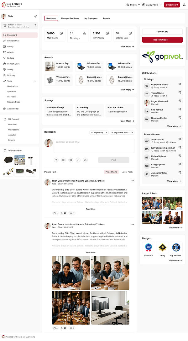
By involving stakeholders throughout the process, we reduced ambiguity, accelerated decision-making, and created smoother developer handoffs.
After
Before


Tablet - Responsive

Mobile - Responsive

DELIVERY
Design Handoff
By involving stakeholders throughout the process, we reduced ambiguity, accelerated decision-making, and created smoother developer handoffs.
OUTCOME
A platform that's easier to use, maintain and grow.
The redesign delivered what the company needed most: a modernized experience that supported the rebrand, improved internal confidence in the product, and gave sales a stronger foundation for new business conversations.
Equally important the design system and documented architecture made the platform genuinely easier to evolve. The work didn't just solve today's problems. It built a foundation for the next phase of growth.
"Binish's role at C.A Short will have a lasting impact on the cmopany. She helped modernize and rebrand our entire platform, contributed to creating a more user-freindly mobile app, and cataloged our deisgn architecture. She not only brough us upt o user expectations but also set us up for the aqbility to expand the product with ease for years to come."
Addie Hutchins, Group Product Manager
C.A. Short / People are Everything

RETROSPECTIVE
What I'd do differently...
I'd push earlier for lightweight usability testing with real end users, HR administrators, and employees, not just internal stakeholders.
Our workflow decisions were grounded in audit findings and solid product logic. But live user sessions would have surfaced edge cases faster and given us harder evidence to resolve disagreements in review meetings.
In a future engagement of this scale, I'd make that a non-negotiable artifact in the audit phase.
NEXT CASE STUDY
A case study of all the iterations was not possible. So below are images of other iterations during my time with Nixon. To decide what solution works best it's important to understand why some design solutions will not solve the problem.


