Chop. Chop. Where is my shipment?
Sleep Number is a wellness technology company. Their purpose is to improve the health and well-being of society through higher-quality sleep. This is a story of how I made a positive impact on the delivery and tracking of inventory that led to the enhancement of the customer sleep experience
To comply with my confidentiality agreement I have gained approval to post these designs on my portfolio as this product INVision app is an internal app used by Sleep Number Employees.

PROJECT
INVision App
Inventory management system with delivery tracking to enhance the home delivery experience designed for delivery and warehouse technicians, along with the archaic customer care system.
TEAM
Product Owner
Technical PM
Design Intern
Lead Engineer
5-7 Developers
Super Users
TOOLS
CLIENT/DATE/DURATION
Figma
User Testing
Service Now
Monday
Sleep Number (INVision App)
05/23/2023 - 11/20/2023
6 Months
MY ROLE
UX Designer
I was the lead UX designer/acting UX manager on the INVision team and was responsible for creating an Android experience for 3 different user groups. I led the UX work, producing all major deliverables and presenting them to the the client between Aug 2022 and Dec 2023. I worked alongside business, product and the engineering team for feedback.
DESIGN THINKING
Design Roadmap
Design roadmaps outline important phases such as research, creative approach, delivery, and implementation.
1
2
3
4
5
6
UNDERSRTAND
What is the problem? What are business requirements?
DEFINE
Who & What are we building for? What is the user pain points and user needs?
BUILD
How are we going to build it?
TEST
How do the users feel?
ITERATE
How can we improve from user and business feedback?
DEVELOP
Handoff to dev/engineers
THE PROBLEM
How might we redesign the home screen and improve the brand identity?
This was the last phase of the total makeover of the INVision app. All the workflows in the app were completely renovated. At this point all we needed to do was connect all the workflows with an improved redesign of the homescreen. We worked backwards to achieve the optimal functionality and to ensure we didn’t leave any loose ends or surprises.
Problems observed from user behaviors
My biggest challenge when redesigning 50+ large workflows was user acceptance of design changes. So it was no no-brainer that this one was going to require some sort of onboarding as well. The challenge was to evolve with the technicians and wow them with the designs to ensure the onboarding was happily boarded by all users. ;)

THE GOALS
Where are we going?
1. Redesign the home screen
2. Establish a new navigation for mobile
3. Improved accessibility, consistency in design, and re-usability of components
THE DIRECTION
How will we get there?
I redesigned all the previous mobile app screens to ensure a smoother and more intuitive user experience using a component-based, atomic design approach.
I focused on the application and the number of tiles/cards needed for the home screen. I took inventory of all the workflows and decided to divide each user profile so that I could account for all the data for each profile.
I worked on the card design individually considering all the varying data that led to my efforts to evolve the home screen and address customer pain points related to the browse and discovery experience.
RESEARCH & ANALYSIS
What is our competition doing?
To gain a holistic understanding, I conducted the following activities:
-
Observational Research: I rode along with delivery technicians, witnessed firsthand home deliveries, observed warehouse technicians using our proprietary mobile app, and shadowed customer care agents.
-
Stakeholder Interviews: we held time with several key stakeholders along the supply chain & logistics spaces, listening to their pain points and concerns with how the current, physical process was performing.
-
Flow Blueprint: All of the data gathered for each workflow led me to map out an end-to-end data blueprint, which spanned from order placement to delivery, to pickup delivery, and into the return/exchange process.
WIREFRAMES
Low-fidelity concepts
Wireframes
Since mobile design already existed, I worked on wireframing and prototyping for the web, to have a better visual sense of the layout.

STYLE GUIDE
iOS Brand Guidelines
Style Guide
Apple design resources helped design apps quickly and accurately using Figma, design kits, guides, and other resources.

VISUAL DESIGN
Final Designs
High Fidelity Designs
My solutions helped users sign in to the web and continue their day-to-day activities/tasks. They now have access to both web and mobile at their convenience.
We helped users (Project Managers) to share their data screens on the desktop to show their reports, and graphs of the projects they are managing. This solution provided easy integration into their workflows and accomplished basic tasks without switching devices.


Results
Did it secure funding?
Final designs allowed the business to flourish with another platform. Also, it serves the users who feel more comfortable using a website.
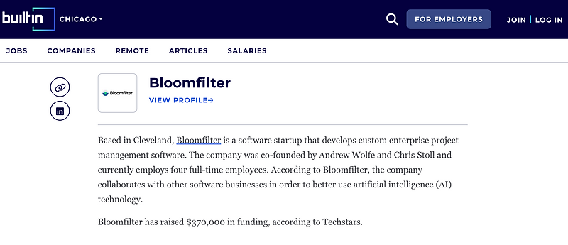
This complete mobile and web application secured funding for this seed startup with Chicago Tech Stars.
This Startup Pitched at Techstars Chicago’s 2022 Demo Day
KEY TAKEAWAYS
Challenges & Conclusion
There were challenges throughout the web design for this app. As I worked through the designs, I noticed that several areas in the app needed a design lift to improve the experience. It was obvious that a mobile screen could have been designed with UX in mind.
The research for this project was challenging because there was no comparable product in the market. I had to use products with a dashboard displaying data similar to our app.
As a UX lead, I gained experience through the transforming challenges that I faced in new design and features from a mobile app to a desktop platform with its complexity.
Other Feature Designs
A case study of all the designs was not possible. So below are images of other iterations/projects during my time with Bloomfilter.